Crafting Tekpak's Narrative: A Journey to Digital Distinction in Co-Packing
Redefining Co-Packing with a Brand and SEO Makeover
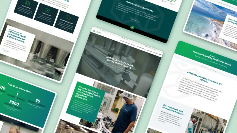
For a quarter decade, Marion, Alabama-based Tekpak, Inc has provided exceptional B2B co-packing services with a focus on powder and granulated products. When they came to us, their branding and online presence just didn't do justice to their expertise. They were ready for a makeover – something that shouted 'modern' and 'innovative' just as loud as their services did.
Approach & Collaboration
A Fresh Digital Blueprint
- Conducted comprehensive market and competitor analysis to identify SEO opportunities and ensure service descriptions were in line with the market.
- Gave their website the structural oomph it needed with well-crafted structured data markup and meta information.
- Developed scalable logo variations for use on the website, social channels, and printed collateral.
- Provided art-direction and shot list for photo shoot, ensuring we had the right images to illustrate the content. We curated and optimized stock imagery to fill any holes.
- Established a clean “voice” for TEKPAK, Inc, and rewrote all site copy, including services, history, and anonymized case studies.
Results
A Fresh Presence for an Established Brand
- What we ended up with was more than just a website. It was Tekpak's new digital cornerstone – sleek, high-performing, and a true reflection of their brand.
- From the logo to the last line of code, every bit of their new online identity was crafted to make them stand out in the co-packing market.
Fine tuning the existing logo.
The original logo for the company had some design issues: the icon had inconsistencies in line width and isometric perspective, and the text needed kerning adjustments between some letter pairs. The client had only a JPG of the logo on a white background, which wasn't versatile enough for the different applications a mark is needed for today.
We corrected the icon's issues, making the line width the same as the text weight, which adds visual rhythm and consistent appearance. Additionally, we provided a new stacked version, color and light and dark options for each, and output them in both vector and pixel file formats. This gives the client the ultimate flexibility to provide a logo that fits the usage.
